Axyom
A deliberate pause between impulse and purchase.
Behavioural-finance apps usually look like every other habit tracker. A streak, a leaderboard, a green dot for every day you managed not to overspend. Axyom takes a different angle: the pause itself is the product.
Every other intervention arrives too late. A budget tells you in hindsight, a tracker tells you at the till. Axyom uses Apple's Screen Time to sit in front of the apps where the money actually goes, so it arrives before the shopping app opens.
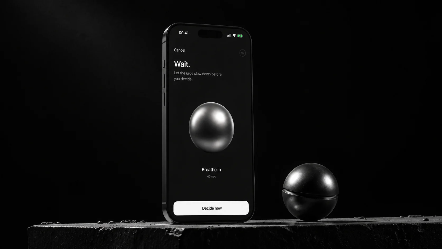
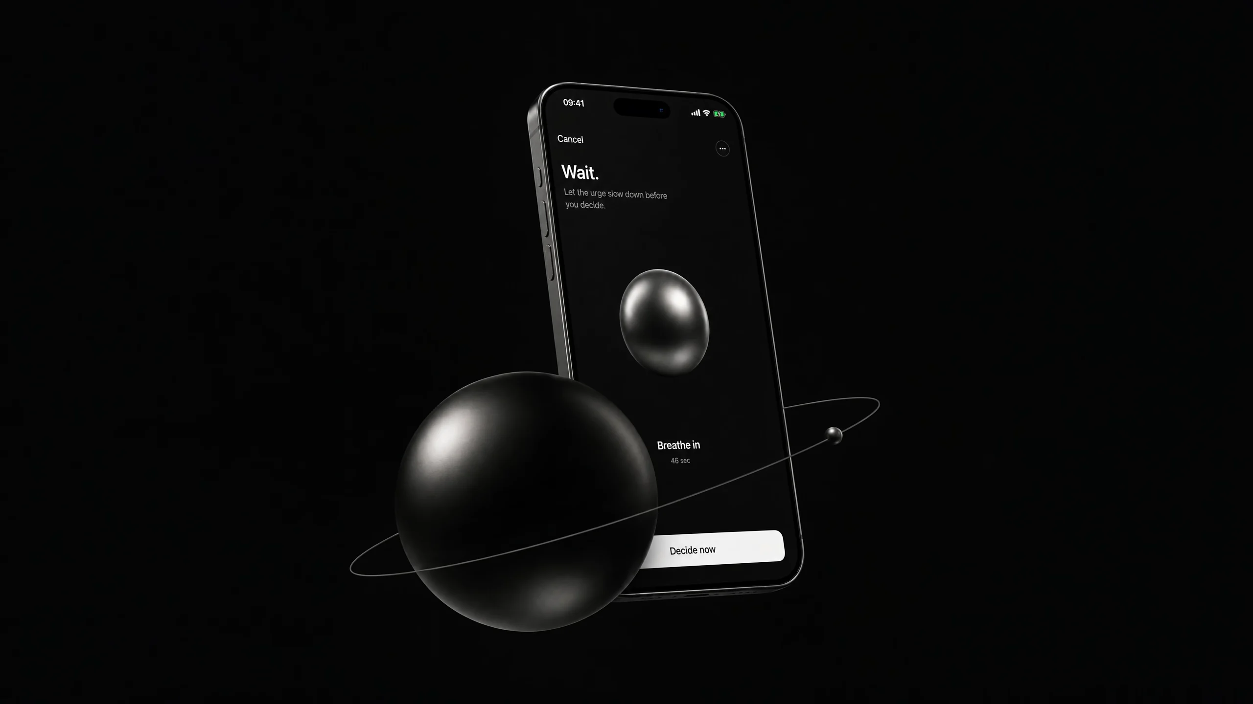
A black screen, a slow breath, and the purchase re-priced in hours of the user's own work. Then three ways out, weighted identically. The product isn't the budget; it's the moment of confrontation.
Designed, built and shipped solo. The first version came together in three weeks. What shipped a year later has three fewer tabs than that first version, and works far better for it.
- Year
- 2026
- Role
- Design + Build + Ship
- Duration
- 3 weeks to first version · shipping since
- Outcome
- Live on the App Store
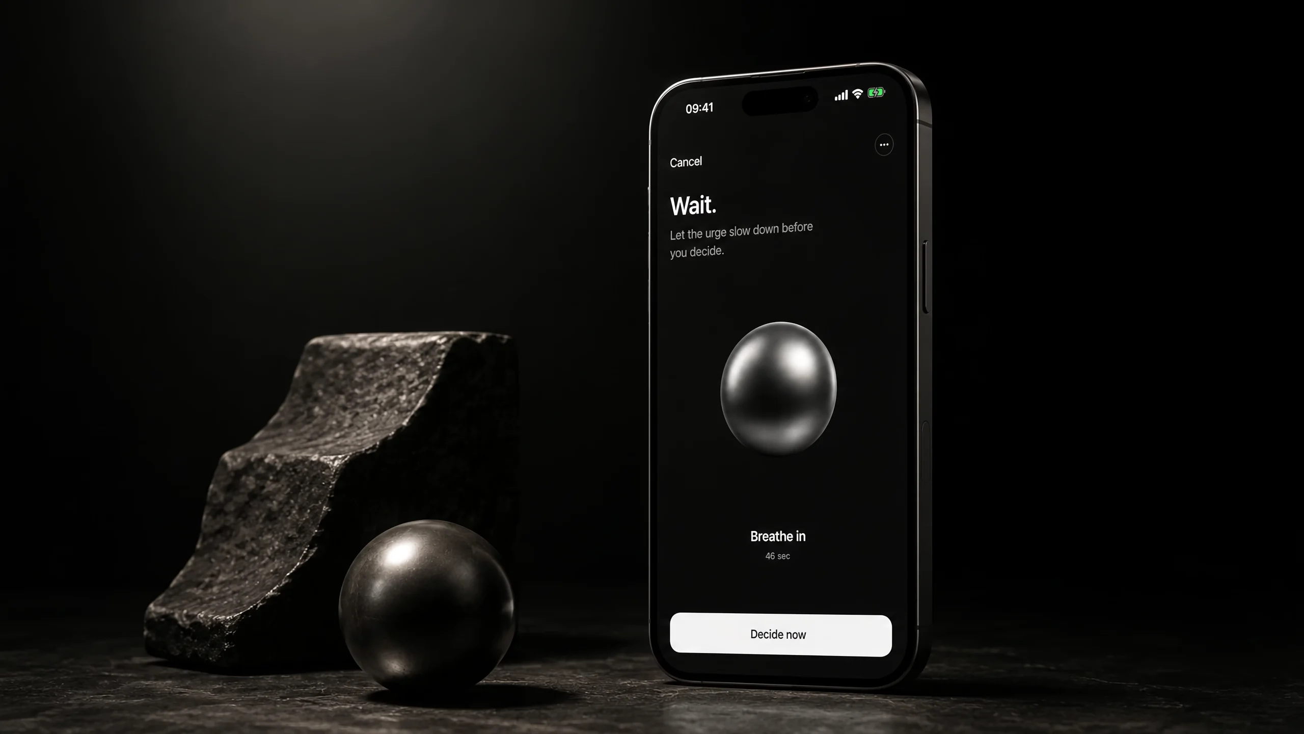
Before the app opens
The user picks which apps get a pause. Apple’s Screen Time shields them, and opening one hands off to Axyom first. Nothing is blocked and nothing is reported anywhere: the app the user chose still opens, a moment later, on purpose.
This is the whole architectural bet. An intervention that fires at checkout is arguing with someone who has already decided. Arriving before the storefront loads means arguing with nobody — there is no cart yet, so there is nothing to defend.
Naming the urge
The flow starts by making the user say it out loud. What are you about to buy. How much. Which category. A purchase that stays vague is easy to make — one typed into a field and given a number is already harder.
One quiet question sits at the bottom: planned, or not. It blocks nothing. It just puts the honest answer on the screen before any money moves.
Priced in hours, not currency
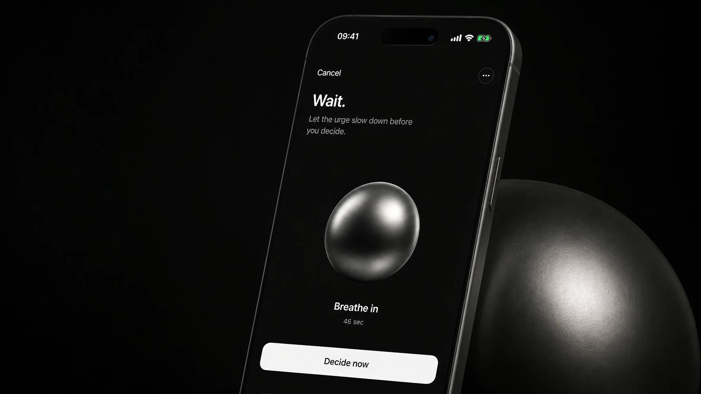
Then the screen goes black. A sphere, a slow breath, and the purchase re-priced in the only unit that stings: time. Not the amount — the hours of work behind it. The financial context that makes that translation possible is optional; without it Axyom simply says less.
Nothing here can be tapped through quickly. The breath has a duration the user sets once: thirty, sixty or ninety seconds, sixty by default. For that whole minute the product does exactly one thing, and it does it without a single notification.
“Behavioural finance is mostly a copy problem. The math is settled; the question is whether the screen earns the user's trust.”
Three ways out, none of them wrong
When the breath ends, three outcomes appear: walk away, plan it, buy now. Identical size, identical weight, identical colour. No green for restraint, no red for spending, no default selection waiting to be confirmed.
That symmetry is the position, not a layout accident. An app that scores you for walking away has quietly decided that buying is failure, and users can feel the judgement. Axyom does not tell anyone which outcome is correct. It only makes sure a choice was made rather than skipped.
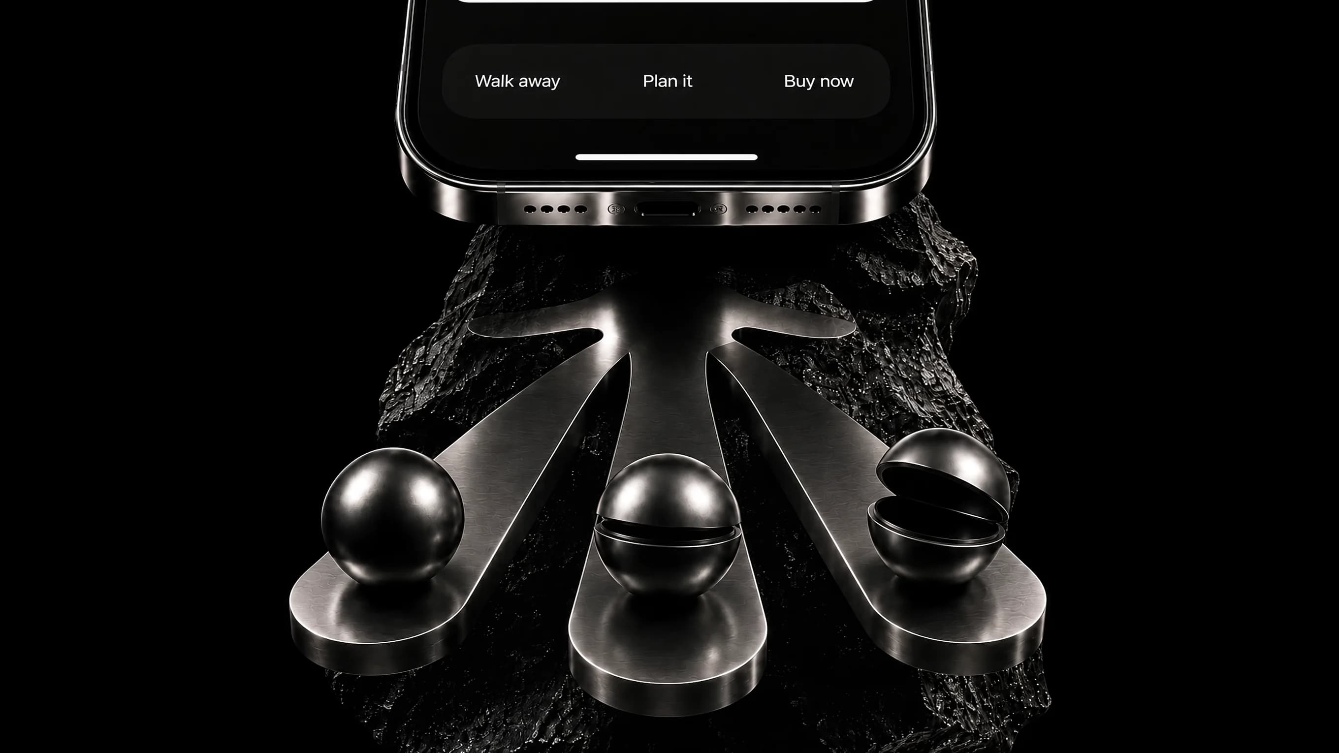
Three arms, three spheres, one weight each
The product in motion
The pause, the breath, the three outcomes and the record, in ten seconds. No narration, no audio, no copy over the picture. The screen has to carry the argument by itself.
Plays muted on viewport. If reduced motion is on, the poster stays put — the still already tells the story.
Every pause, on the record
Two tabs, and one of them is settings
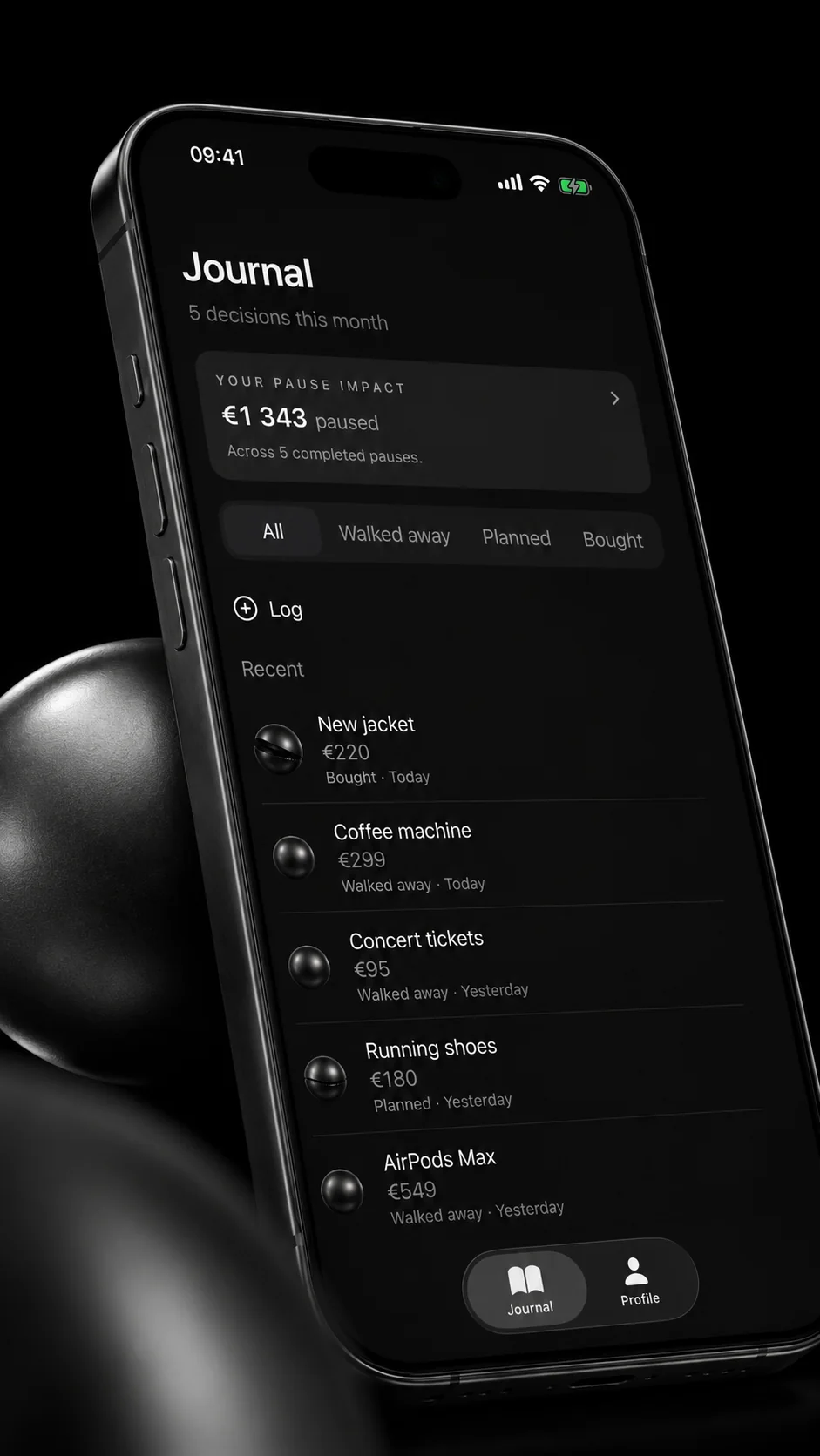
Every completed pause lands in the Journal on its own: the item, the amount, the outcome. Above the list, the only number Axyom keeps — the amount paused, totalled per currency. It counts decisions made, not money withheld, and it is deliberately not a score.
The first version had five tabs: pause, plan, coach, learn, profile. The shipped app has two, Journal and Profile, and the Journal is home. Cutting three tabs removed the parts that were explaining the product and kept the part that is the product. That was the hardest and the most valuable decision in the build.
Solo build, live on the App Store and shipping. No account, no bank connection, no transaction tracking: the pause history stays on the device.
- Swift
- SwiftUI
- Screen Time
- Railway
- Anthropic Claude
- iOS
[ Sizing your own project? ]
Use a quick diagnostic before you build.
Cazen

Bring one workflow. Leave with a build plan.
Axyom Studio is fully booked for Q3 and Q4 2026. New projects are currently being considered for Q1 2027.
Prefer email
hello@axyomstudio.com- Availability
- Q1 2027
- Capacity
- 2 engagements
- Based
- Seoul, KR